
Managing personal finances effectively requires clear visibility over incomes, expenses, investments, savings, and debts. A financial dashboard offers an at-a-glance view of your monetary health, allowing you to make informed decisions and track progress towards financial goals. Google Sheets stands out as an accessible, customizable, and online-friendly tool to build such a dashboard without high costs or complex software.
Creating a personal financial dashboard in Google Sheets combines data organization, visualization, and automation to provide continuous insights. This article outlines practical steps and best practices to design a dashboard tailored to your needs and maximize your financial management capabilities.
Understanding the Importance of a Financial Dashboard
Before diving into the technical setup, it’s essential to grasp why a financial dashboard can transform your budgeting and planning habits. According to a 2023 survey by the National Endowment for Financial Education, 67% of Americans reported improved financial control after regularly tracking their finances using digital tools. A well-designed dashboard condenses multiple financial tables and charts into concise views, reducing decision fatigue and increasing motivation through visualization.
Unlike traditional spreadsheets, a dashboard focuses on summarizing and highlighting key metrics such as net worth, monthly cash flow, and budget adherence. For example, instead of scrolling through exhaustive expense records, you see a dynamic pie chart or bar graph illustrating where your money goes each month. Several real cases illustrate its power: a freelancer increased savings by 20% within six months after spotting recurring service subscriptions they no longer used, thanks to dashboard alerts.
Setting Up the Foundation: Organizing Your Financial Data
The first practical step in building your Google Sheets financial dashboard is organizing your raw data systematically. Start by creating separate sheets or tabs for income, expenses, debts, investments, and savings. Each sheet should have standardized columns such as Date, Category, Description, Amount, and Account.
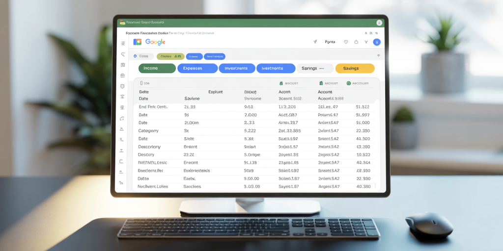
For instance, the Expenses tab might include entries like:
| Date | Category | Description | Amount | Account |
|---|---|---|---|---|
| 2024-06-01 | Groceries | Walmart purchase | 75.40 | Checking |
| 2024-06-02 | Utilities | Electricity bill | 120.00 | CreditCard |
Categorizing expenses helps in tracking patterns and creating aggregated calculations. Use consistent naming conventions to allow easier referencing across sheets.
To automate data input, consider linking with Google Forms or banking apps that support CSV exports. Although automatic bank data integration requires complex scripting or third-party add-ons, even manual import of recent transactions can keep your sheets current.
Designing Key Metrics and Calculations
Once your data is organized, the next step is to formulate the calculations your dashboard will display. Common key performance indicators (KPIs) include total monthly income, monthly expenses by category, savings rate, debt-to-income ratio, and net worth over time.
For example, calculate monthly total expenses by using the SUMIFS function:
“`excel =SUMIFS(Expenses!D:D, Expenses!A:A, “>=2024-06-01”, Expenses!A:A, “<=2024-06-30”) “`
This formula sums expense amounts within the specified date range.
Create dynamic ranges to update calculations automatically as you add new entries by using the ARRAYFORMULA or QUERY functions. Also, incorporate conditional formatting to flag overspending, such as highlighting budget deviations exceeding 10%.
Here’s a comparative table of essential financial KPIs and their formulas:
| KPI | Purpose | Sample Formula Example |
|---|---|---|
| Total Monthly Income | Sum of all income sources | `=SUMIFS(Income!D:D, Income!A:A, MONTH(Date))` |
| Monthly Expenses | Total outflow in the month | `=SUMIFS(Expenses!D:D, Expenses!A:A, MONTH(Date))` |
| Savings Rate (%) | Percent of income saved | `=(SavingsAmount / TotalIncome) * 100` |
| Debt-to-Income Ratio | Measure of debt burden | `=TotalMonthlyDebtPayments / TotalMonthlyIncome` |
| Net Worth | Assets minus liabilities | `=SUM(Investments!D:D) + Savings!D:D – Debts!D:D` |
Using practical formulas ensures consistent updates and accurate tracking, crucial for making data-driven financial decisions.
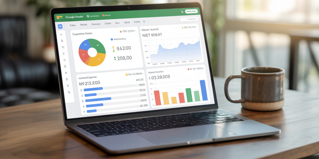
Visualizing Financial Health with Charts and Graphs
A major advantage of Google Sheets is its built-in charting capabilities, enabling the conversion of raw numbers into intuitive visuals. Visualizations enhance comprehension by showing trends, balances, and problem areas at a glance.
Start with a pie chart separating your expense categories monthly, so you can quickly identify high-cost areas like dining out, subscriptions, or groceries. For example, if entertainment expenses consume 25% of your budget, you can evaluate if reductions are necessary.
Next, line charts plotting net worth progression over several months give insight into long-term financial improvements or setbacks. For instance, showing a consistent upward trend reflects successful saving and investment strategies.
Bar charts comparing income versus expenses by month highlight cash flow health. Conditional coloring (e.g., red bars for months with deficit, green for surplus) can make this even more apparent.
Here’s a table illustrating suitable chart types for different financial objectives:
| Financial Focus | Recommended Chart Type | Benefit |
|---|---|---|
| Expense Distribution | Pie Chart | Visualizes categories as proportions |
| Net Worth Trends | Line Chart | Tracks progress and fluctuations over time |
| Income vs. Expense Ratio | Bar Chart | Compares inflow and outflow monthly |
| Debt Repayment Progress | Stacked Bar Chart | Displays portions paid vs remaining debt |
Incorporate charts on the main dashboard sheet, where all data summary views come together. Use filter options or dropdown menus for interactive selections such as month or account type.
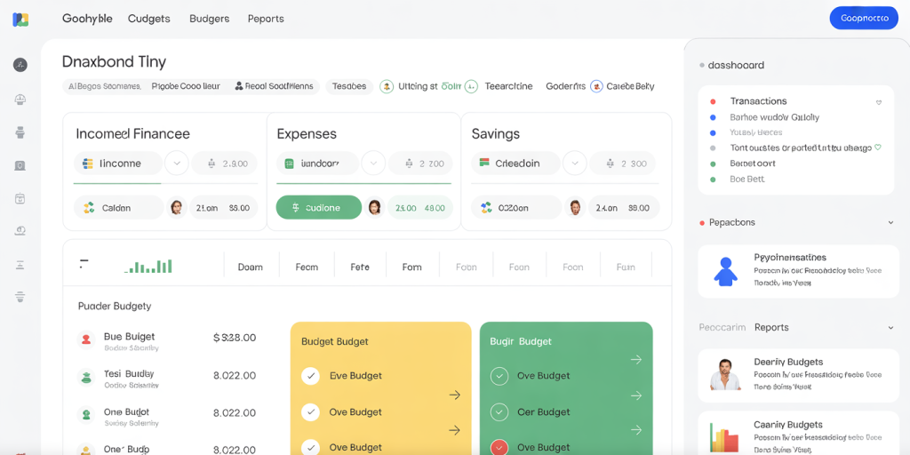
Enhancing User Experience with Interactive Features
To make your financial dashboard more dynamic and user-friendly, Google Sheets offers tools like drop-down menus, checkboxes, and slicers. Integrating these can transform the dashboard into an interactive decision assistant rather than a static report.
For example, use Data Validation to allow users to select the month or year for which financial metrics appear. This enables quick switching between time periods without manually changing date ranges in formulas.
Adding slicers to pivot tables lets you filter data by categories such as income source or expense type, focusing the analysis on relevant segments. If you’re tracking multiple accounts, a selector for bank accounts or credit cards helps isolate specific cash flows.
Checkboxes can flag irregular transactions or planned payments, adding notes directly on the dashboard for better context during reviews. Conditional formatting paired with these features can highlight overdue bills or budget overshoot.
In a practical case, a Google Sheets user who integrated monthly dropdown filters and account slicers reported a 35% time saving in monthly budget reviews. This freed more mental bandwidth to plan savings and investments.
Future Perspectives: Leveraging Automation and Integration
The financial landscape is evolving rapidly with advances in automation and AI-driven tools. While Google Sheets serves as an excellent foundation for a personal financial dashboard, future steps can push capabilities even further.
One emerging trend is automatic bank feed integration via secure APIs or fintech platforms, which synchronizes transactions in real-time without manual imports. Although this requires programming knowledge or premium add-ons like Tiller Money, the time savings and accuracy gains are substantial.
Artificial intelligence is also making inroads: chatbots and virtual financial advisors powered by AI can analyze your Google Sheets data and provide personalized recommendations. For instance, predictive models can estimate upcoming expenses or flag potential budget risks based on historical patterns.
Further customization using Google Apps Script allows automation of tasks such as monthly report generation, email alerts for low balances, or auto-categorization of new transactions.
Looking ahead, combining Google Sheets financial dashboards with cloud-based tools and mobile apps will enable on-the-go access and better integration with overall digital life management. Enhanced data security practices like two-factor authentication and encryption will ensure privacy alongside convenience.
Adopting these innovations, individuals can maintain tight control over personal finances, achieve goals faster, and safeguard financial welfare in an increasingly complex economy.
Deixe um comentário